Mitchell's Blog
Visual Literacy Blog

Feb
08

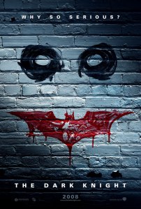
When we were assigned to review a static image this week I instantly knew what I wanted to review. I decided that I wanted to review a movie poster from one of my favorite movies of all time. So I choose the “why so serious” poster from Batman The Dark Knight.

What I like about this poster is that there is repetition displayed in it. For instance if you look at the white bricks that make up the background, you will notice that they are all relative to the size of the horizontal bricks that are to the left and right of that brick. I also like the use of the color red in this poster. The color red in this poster is used to show the batman symbol, which appears to be made blood, and it completes the happy face symbol that represents the Joker, who is the main villain of this movie. I also like the simplicity of the movie poster in its colors and text. By using only three colors, the viewer is able to look at the poster quickly and understand what it is for and what it means. Also, with the text it stands out and is easily read while at the same time it does not have a major presence in the poster. The final aspect of the poster that I really like is how the eyes and the batman symbol are drawn. They are in a style which appears as though they were painted with fingers. This works really well not only with the background which is tattered and damaged but it gives you a feeling that the Joker himself drew it.

However, there are two aspects of the poster that I do not like. The first is that right above knight there are two black splotches that appear to be peeling paint. In my opinion this detracts from the over all background and creates a distraction from the rest of the poster. The final aspect of the post that I don’t care for is the major blood drop in the middle of the batman symbol. While I do like the smaller ones in other areas of the symbol the big one seems over done and it takes away from the over all symbol.

Beyond that I love this movie and the poster. I still find it funny that if you say “why so serious?” to someone they will more than likely know exactly what you are talking about.
Feb
01

Ethan Meleg is a professional photographer from Ontario Canada who has multiple photo galleries, which contain wildlife and scenery from all over the Americas. Ethan is also a major photographer for multiple magazines such as National Geographic, National Wildlife, and Ranger Rick. I chose to do Ethan Meleg after running into one of his photographs of birds on a website by one of his friends. However, I decided to do my review on his prairie photos taken in Saskatchewan, Canada (found here) because out of all of the galleries this gallery caught my attention more than the others.

What works with these pictures are the deep colors and saturation that are exhibited in them. When you view these pictures the fact that they seem unreal is one of the best reasons to look at them. Also, the way that he sets up his shots such as the fields of hay as seen (here) are not only fun to look at but the colors blend together in a mesmerizing style. Also in pictures such as (this) the sky has a interesting effect where it goes from a deep dark blue to almost completely white which gives a great contrast and adds to the range of vivid colors in the photo.

While there aren’t a lot of negatives in his album there is one picture that sort of ruins his preview in my opinion. (This) picture while of a shack doesn’t have any or as much of the brilliant colors that are exhibited in the rest of his album. While the picture may be there to interest potential customers, as to show he does take pictures of old towns, it ruins the majestic effect of the prairie and seems very our of place. Over all Ethan Meleg is a stellar professional photographer and I absolutely love viewing his work.

Feb
01
Metro train

By Mitchell Stover

When I was assigned to do a Photo Essay last week in class I wasn’t quite sure what I was going to do. Originally I was thinking on getting my friends to make a snow man with the snow that came on Saturday however, none of them seemed all that interested in building one. After being stumped my friends and I went out to celebrate a birthday and on the way we took the metro.

Granted, this is not the most original idea however, the metro (at least to me) is something that is new and interesting. The theme for this photo essay is transportation and I chose this theme because depending on where you are in the world transportation means many different things. In certain areas of the world walking and riding bicycles are the main modes of transportation and in other areas public buses and subways are the biggest mode of transportation. For instance I am from Harrisburg Pennsylvania and in my area when you say transportation people don’t think about buses or metro’s we only think about cars because there is extremely limited transportation. This is why the theme and word transportation is interesting to me because depending on where you are from the word never changes but can mean multiple things.

To create this photo essay I stood at the very end of the metro platform and took pictures of the train as it was coming it. I decided to use optical zoom in order to get a close up and pan back as the train was coming in. However, midway through the train coming in I realized that it wasn’t going to work because the poor lighting made it hard for my camera without manual focus to focus. So I began to zoom the whole way back out and took pictures again until the train came to a complete stop. After wards I went back and edited out blurry and poor pictures and imported the final ten into photoshop. I then proceeded to create a canvas that was 9600 by 2160 so that it could fit the ten 1920 by 1080 photos on it in two rows of five. Then I simply copy and pasted the images on and put them in the correct order and then removed the color, which gives you what you see above.

What I like about the photo essay is that especially in the last two photos there are people in them but their faces are blurred which gives you the sense that people are there but they are mysterious and it gives you a sense that the train is actually moving. What I don’t like though is the fact that I zoomed in with the camera. I think it actually ruined the shot because while it does look like the train is getting closer it isn’t till its really close in the photo that you can really tell it is moving. The last thing that I would do again if I had the opportunity is to try to play with the camera settings to get the pictures to be brighter and maybe a bit more blurred to give you the sensation that it is moving towards you.

Jan
26

To see picture please click on LINK

In the picture “Balancing Act” by Maxina Belle, the Japanese amazon.com mascot is seen standing on a chain wire. Maxina Belle, is a photographer who takes pictures of many various objects in many various settings. One of the objects in this case is this little robot which is called Revoltech Danboard and is well known in some internet circles as simply the cardboard box robot.

Over all I love this picture, it has a constant green and yellow hue to everything and I find it amazing that she was able to balance that little robot on the chain. I also like how the camera is focused mainly on the box robot so that there is only one thing going on in this scene. I also like how the string bends down and that the cardboard robot appears to be in the lowest part of the curve on the chain. This little detail adds a lot and shows that Maxina Belle is one of those people that pay attention to small details.

I believe that the way she got the little robot to stand up is not all that different then the way that I got my paper man to stand up. I think that she took a small amount of tack and put it behind his two legs to keep him balanced. Beyond that it is obvious that she used a wider aperture in order to make the background blurry and to make the foreground, which has the cardboard robot clear. I also believe that to achieve the yellow and green hues to the cardboard robot and to the rest of the scene that she slightly modified the coloring in picture editing software.

Over all this picture is very solid and well put together, however, I believe that there is one change she could do, to make the picture just slightly better. For instance the brightness of the photograph in my opinion is a bit high. I would recommend reducing the brightness to make the robot a bit more eye grabbing. I would also lower the brightness of the picture to make the background less appealing. While the colors in the background are great the first time I looked at the photograph all I was paying attention to was the background. By making the background darker it draws less attention to it and focuses more on the cardboard robot.

As I stated before this is a solid photograph and I really enjoy it not only because it inspired me for my photograph. But, it is something that’s just pleasing to the eye to look at. There aren’t a lot of flashy things going on, it just one character standing on a chain. Simplicity can be golden!

Jan
26
Visual Literacy

This is a image taken for a American University Visual Literacy Class

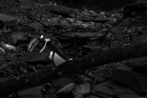
Last week in my Visual Literacy class I was given the task to take a picture of something that is derived, motivated, or communicates balance. At first I had no idea what I should do and how I would go about communicating balance. So, in order to gain some ideas, I went onto flickr.com a photo sharing website and found this picture of a little cardboard character balancing on a chain. This immediately set my mind going as to what I could do. At first I thought that I would attempt to make a 3D character such as the one in this picture. However, after I completed my version of the character, I realized that it created boring pictures that weren’t compelling. So, I went with plan B that you see above.

In the above picture there is a stick man who is often seen on no running signs carrying a umbrella. This character appears to be walking slowly across the log that is spanning a small stream. If you look at the photo which was referenced in the first paragraph you can see exactly where the inspiration for this picture came from. However, the idea of having the picture in black and white came completely by accident. While I was playing with some of the manual settings I accidentally switched to black and which mode and after see this I decided to take just a few shots for fun. As it turns out the black and white pictures looked better than the color ones so I decided to stick with it.

What I like about this picture is that by using black and white the colors of the natural objects (rocks, log, water, ect.) work together with the colors of the unnatural object (the paper man) and balance each other out while still remaining two separate entities. Another aspect of this picture that I like is how balance is shown in the natural objects. For instance, there are sticks in the stream as well as leaves that are not only in the stream but on the edges of it as well. This shows that the stream is in a natural state which without any human intervention would be balanced with the rest of nature.

What I don’t like about this picture though is how on the right of the running character there is a white edge. I don’t like this because it highlights the character more which defeats part of the purpose of this picture with is the balance of both the man and nature. This was caused by the Adobe Photoshop filter that was used to create the character before he was printed out and put on the log. Another small aspect about the photo that I don’t like is how the log is still out of focus even though the character is on it. While it may be a very small detail it is the one part of this picture that bugs me.

Jan
19

Rooster Teeth Productions is a very small production company, which is mostly known for its machinima series Red vs. Blue.  However, recently it has started to experiment in comedic live action shorts. In one of these shorts called “Catch”, three guys named Joel, Matt, and Nathan are playing catch when a conversation starts about their fathers.   As Matt begins talking about his father he becomes distracted and hit by a baseball which was thrown by Nathan.   As the short continues Matt constantly becomes distracted and is hit first by two more baseballs, then a basketball, and afterwards has a knife thrown at him by Nathan.   After the knife is thrown at Matt, Matt and Joel agree that Nathan has gone too far.   Matt of course wanting to get even with Nathan wants to throw a baseball back at Nathan. However, a truck comes and runs Matt over, after Matt is hit a old man gets out of the truck and explains that he is Matt’s father and he is looking for Matt.  When he finds out that he has run Matt over he becomes distressed until he is hit by a baseball.

The short “Catch” is over all a very well put together short because it combines a cinematic effect in the beginning with a funny and comedic ending.   For instance, in the opening sequence of the short there’s a color change in order to bring out the yellows of the scene with a brightening of the over all video and the scene is in slow motion.   These effects along with the slow melodic music and the fact that they are in a field of sunflowers, gives the impression of a happy event.   Also, the attention to certain details such as the coloring of Matt’s, Joel’s, and Nathan’s shirts so that they do not interfere with any of the coloring effects.  This along with the joke after joke creates a very well put together short.

This is not to say though that there are not certain parts of the short that could be improved upon.   For instance in the end where Matt is hit by the truck, the effect that is used is a masking effect where one layer has Matt falling down and another has the truck coming in.   While it is very hard to combine and accomplish this effect flawlessly, the truck pulls up further than Matt falls down.   While this may be a minor flaw, if you are a person who edits films or has incorporated this type of special effect, you realize it.    Also, near the end of the short, Matt and Joel discuss switching the direction in which they throw the ball.  This part of the short seems a little out of place and the discussion should be more focused on discussing their fathers so that it flows with the rest of the discussions and adds to the irony.